
Wovn.io enables access to online content across languages, localizing websites and apps into more than 45 languages and 79 locales.
The work defines a brand system that scales across languages, formats, and channels, while remaining simple to apply across teams.
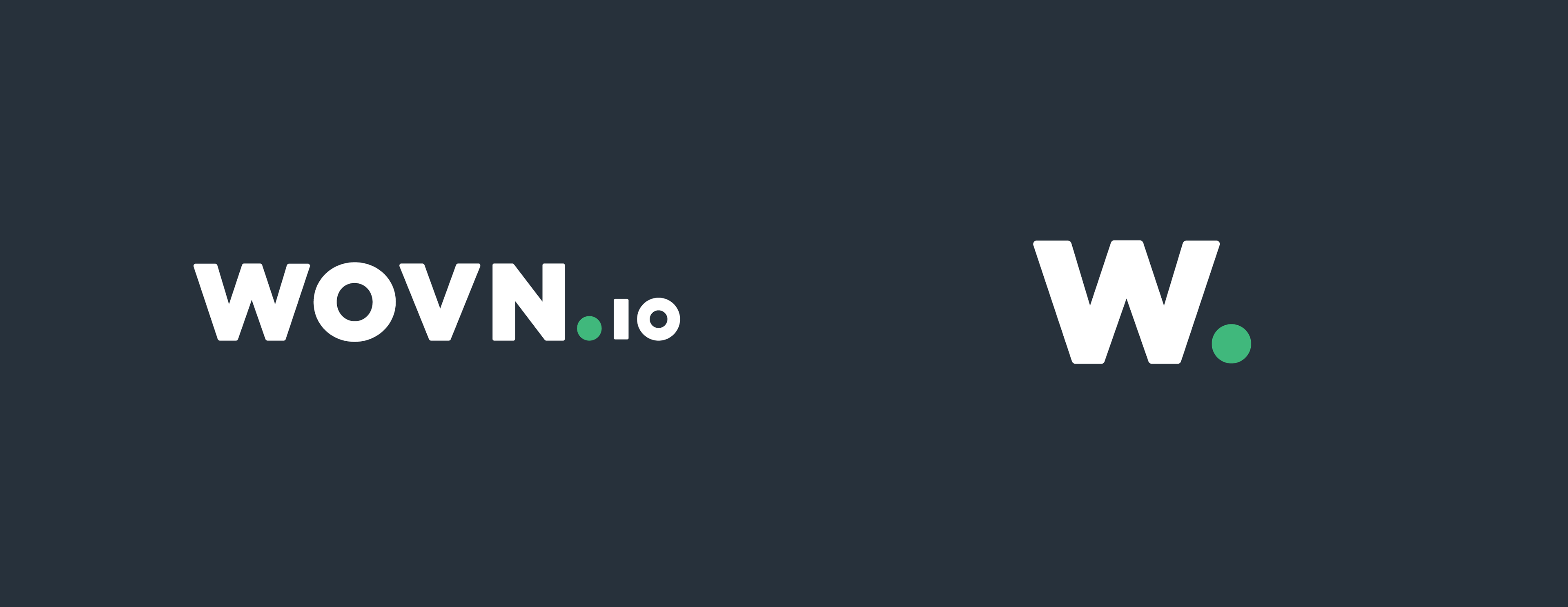
The WOVN logo is the primary mark used across all applications.
The “W” acts as a compact version for constrained formats.
The color system was restructured into a clear hierarchy, consolidating existing tones and introducing a contrasting accent for calls to action and emphasis.
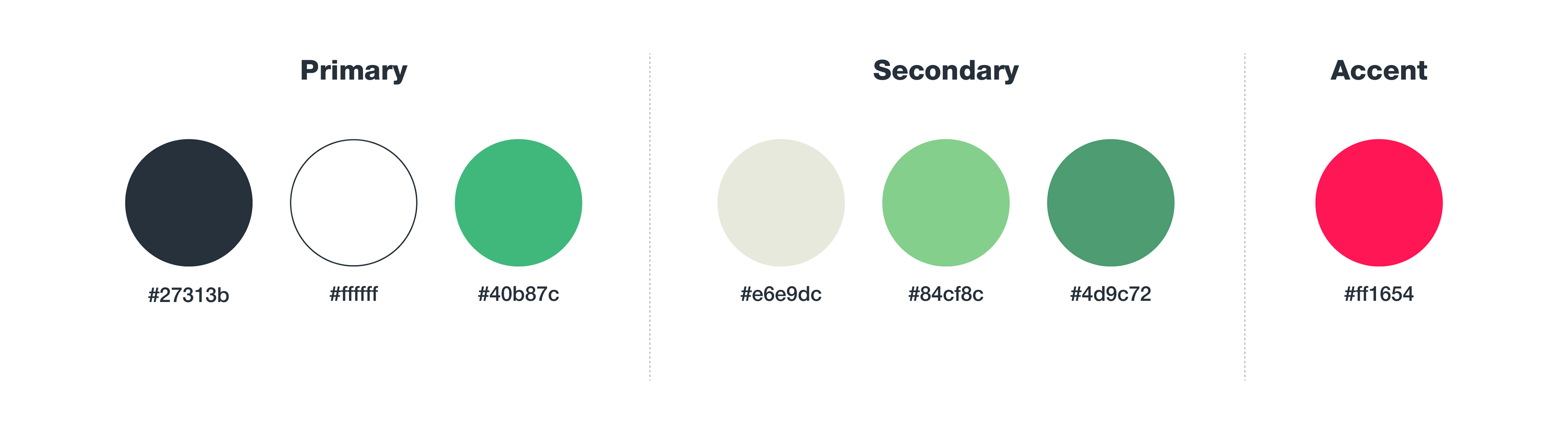

Color ratios were defined to ensure consistency across applications.
Working on a localization platform, typography became a constraint rather than a style choice — it needed to support multiple scripts while remaining consistent and readable across contexts.
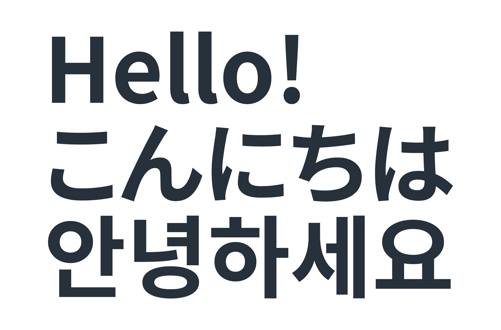
Text styles were adjusted to account for differences in density and rhythm between Latin and CJK scripts, ensuring consistent readability across languages.
Noto Sans was selected to support the system, offering broad language coverage and consistent rendering across scripts.
Noto Sans was selected to support the system, offering broad language coverage and consistent rendering across scripts.

A unified icon system was defined for product and marketing contexts, using simple geometric construction to ensure clarity and consistency across scales.
The system extends into motion, with subtle animations reinforcing the same visual language.


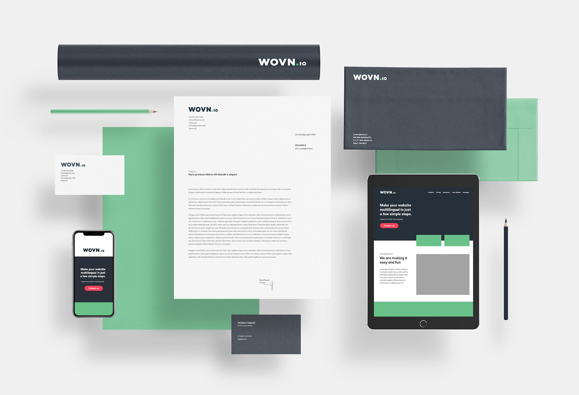
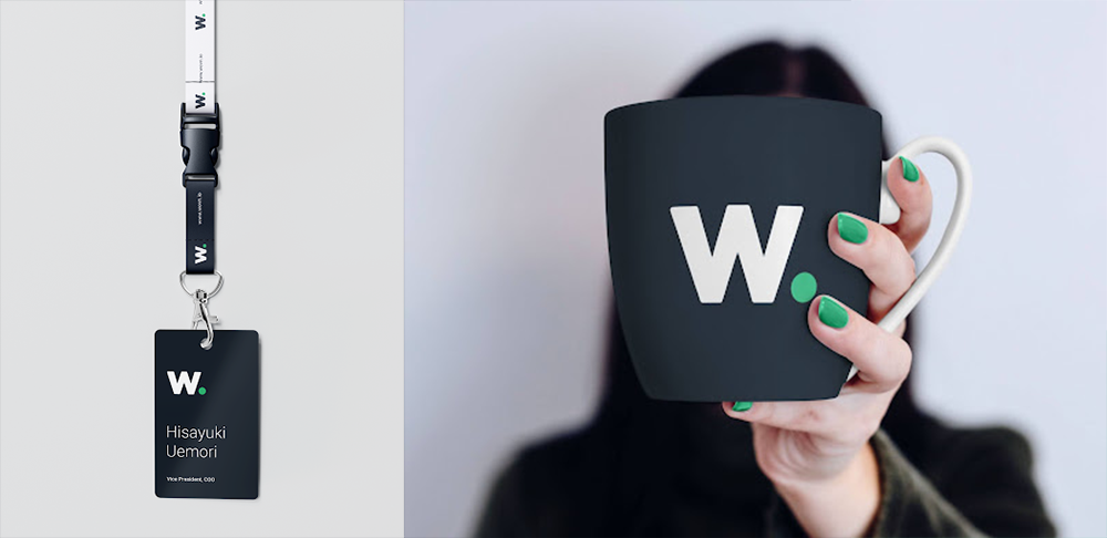
The system extends across digital and physical touchpoints, maintaining a consistent presence in everyday use.
The work produced a compact brand manual used by internal teams and partners, enabling consistent application across languages, formats, and touchpoints.
It covers identity, color, typography (including CJK), iconography, motion, and composition.
Role
Creative & Art Direction — Brand System Design and Documentation
Creative & Art Direction — Brand System Design and Documentation
Collaboration
Wovn.io internal design and marketing teams
Wovn.io internal design and marketing teams